
In search of the perfect search for Wikipedia
Robin Schoenbaechler, Senior User Experience Designer, The Wikimedia Foundation
In a recent project, the Android app team decided to improve one of their core experiences: searching for articles on Wikipedia. Community feedback and previous usability tests revealed, that the app’s search functionality was perceived as inconsistent. Our goal was to make the discovery process for readers more intelligent, personalized and efficient to present the right result at the right time.
With a market share of 72%, Android is by far the most used mobile operating system worldwide. The Wikipedia Android app team builds features for more than five million active readers per month. And it‘s not a secret, that the majority of the next billion users are likely joining the internet on an Android device. What does that mean for the Wikipedia Android app? Uncle Ben from Spiderman said it best: “With great power comes great responsibility“.
To be able to make an educated decision about one of our app’s core features, we had to take a step back and understand how people are using the app.
How do readers navigate to articles?
The team collected usage data and insights from readers who had explicitly opted in to sharing their anonymized usage data. We wanted to understand how readers currently access Wikipedia articles in the Android app.
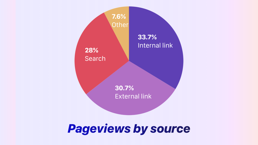
We discovered that the pageviews were almost equally distributed into thirds. At 33.7% the largest portion of readers, visit articles via links from other Wikipedia articles. This data supports the reader behavior known internally as the Wiki rabbit hole, where reader[s] travel by navigating from topic to topic while browsing Wikipedia. 30.7% of readers enter into an article via external links, these readers likely perform a search request via their default browser and are taken to the Wikipedia article in the app. Finally, 28% of all article visits (1.5 million readers a month) utilize the internal search bar for their queries.
What did the data tell us?
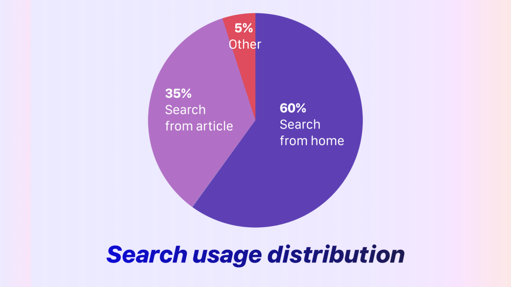
We knew now that 28% of all page views derive from the internal app search. However, we wanted more insight on how the different internal entry points for search are used. To accomplish this, we had to dig deeper into the data. Together with our analytics team we explored how readers commonly used the internal search.
First, we examined how the search experience worked and looked like. There were two main entry points to perform a search:
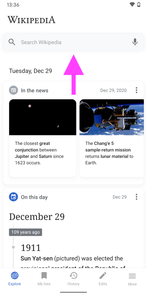
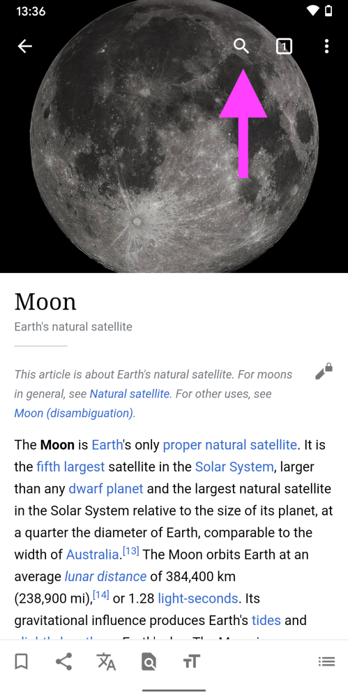
Data revealed that approximately 60% of all readers access the search via the first entry point, a search input field in the Explore feed. Around 35% of readers were searching via the search button at the top of article (second entry point). Since the majority of our user base uses Wikipedia to read articles, we expected that most readers rely on the search button at the top of an article – so this was a surprising insight!
At this point, we asked ourselves if the search button in the articles is not obvious enough, as our hypothesis was that people were navigating back to the home screen to make use of the first entry point.
What did the readers tell us?
To gain further insights about how search is used, our engineering team created three variants for a usability test. Each variant had a different design and position for the main Wikipedia search in the article. Our goals were:
- Find out about pros and cons of each variant, with a specific focus on discoverability and speed of access.
- How discoverable is the search functionality in each variant?
- How can the specific variants be improved?
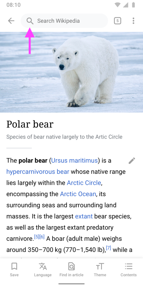
- Variant A was inspired by the analytics insight that two-thirds of all readers search via input field in the home screen. This version put the search input field at the top of the article, as it is on the home screen.
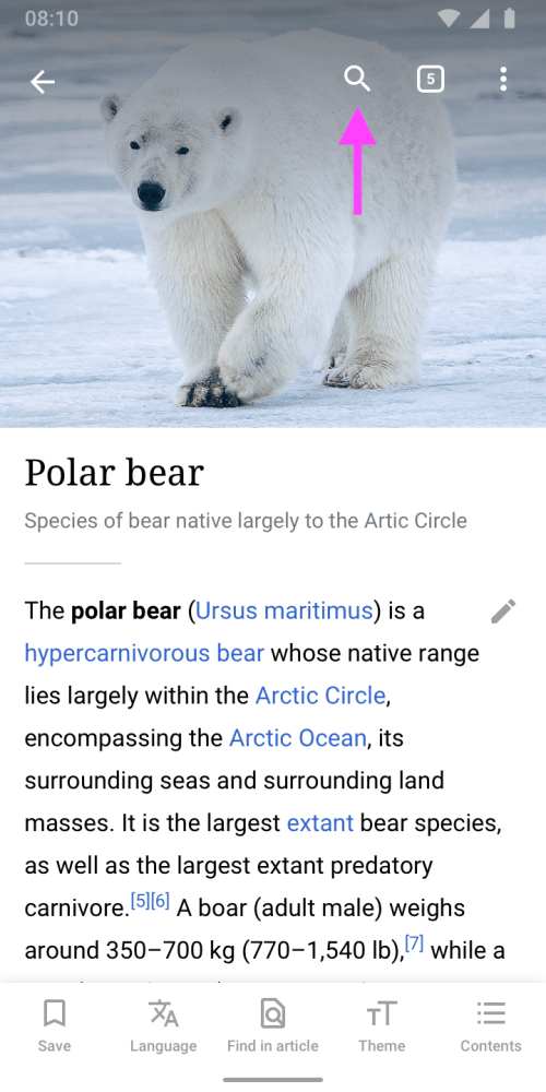
- Variant B was the existing search experience in the app. To save vertical space, the image ratio and treatment was also slightly different.
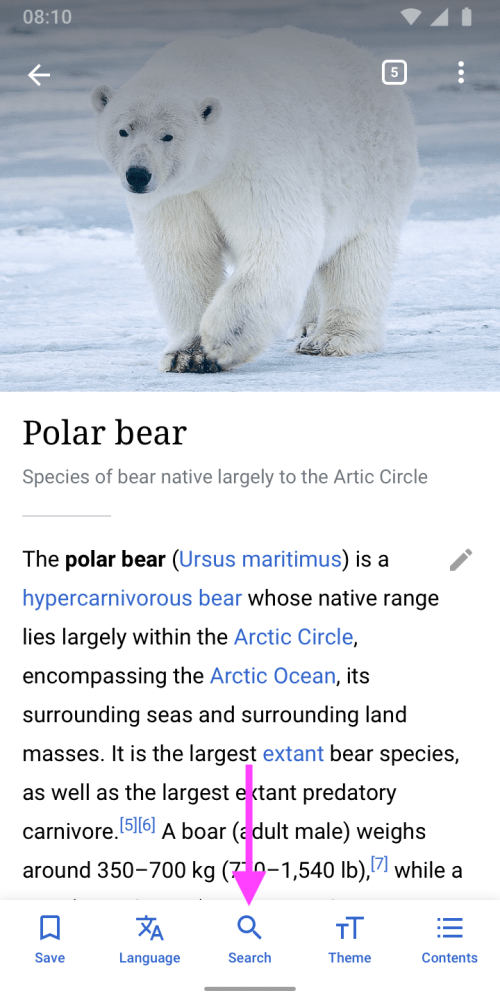
- Variant C featured a search button in the bottom toolbar. The goal of this variant was to provide a more ergonomic search experience that should reduce “thumb travel” when reaching it on a smartphone. Find in page was moved to the overflow menu at the top right.
We went for an unmoderated, task-based test on usertesting.com. Participants were given a set of tasks to complete in a 15-20 minute time frame and perform the test remotely. Check out more details about the test here.
What is your guess on which of the variants performed best in the usability tests? I bet if Luke Wroblewski, aka Mr “Obvious Always Wins” had guessed, he’d have guessed right. Yes, it was Variant A.
Overall, participants had no issues finding articles after installing the app.
- Similar to what we saw in analytics data, all participants directly used the search input on top of the Explore feed.
- Our hypothesis, that participants were remembering their initial action once they were prompted to search for another article from the article page, turned out to be true. All participants naturally used the search input in the article.
- From observing participants, we assume that readers are familiar with the look, feel and functionality of a search input from web browsers, such as the default web browser on Android: Chrome.
Due to these reasons, we decided to move forward with the large search input field at the top of the article. The change guarantees great discoverability for searching Wikipedia and as a bonus, the find in article feature.
How did we make search more intelligent?
Along the way of optimizing the discovery process for articles, we realized that there was room for improvement in how we handled search queries with no results. One of the amazing things about Wikipedia is that it exists in more than 300 languages. Notably, a third of our readers access articles in multiple languages and effortlessly switch between different language versions of Wikipedia. When using Wikipedia on web, these are completely separate websites: en.wikipedia.org and de.wikipedia.org, for example. One of the strengths of the Android app is that we can make these boundaries disappear.
In the example below, you’ll notice that, even though multiple languages have been set in the app, the German word “Schabrackenschakal” (a type of jackal) outputs zero results in the old version of the app when English Wikipedia is selected.
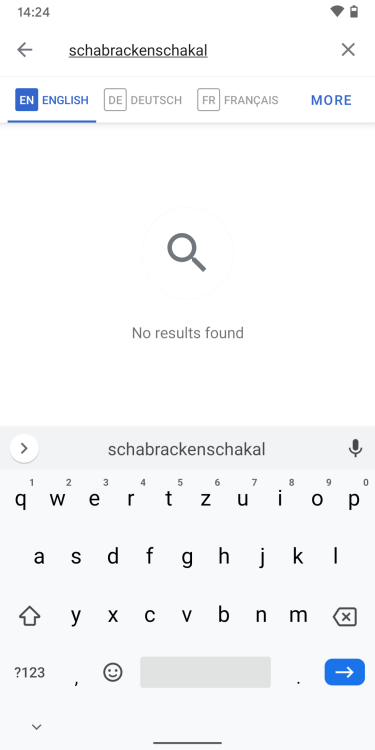
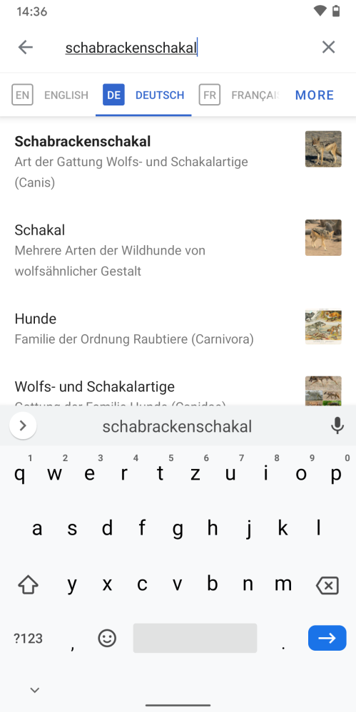
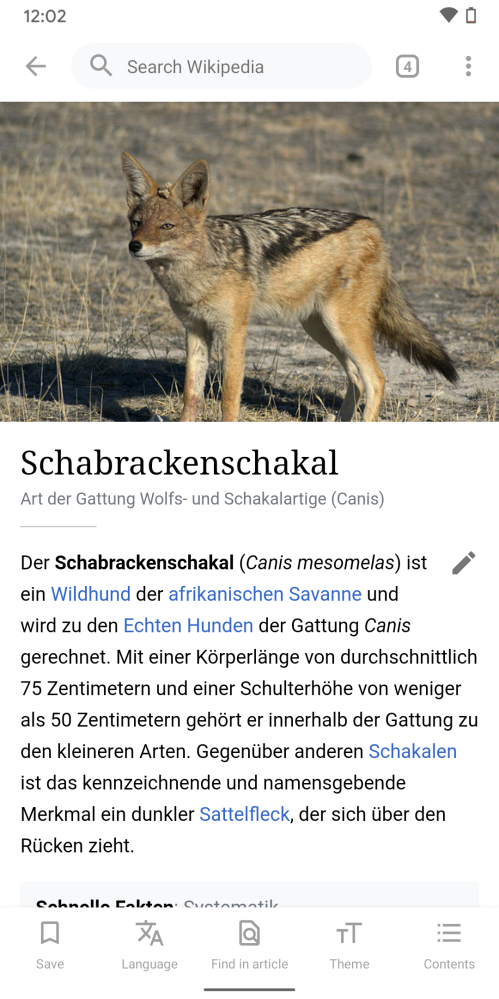
In this case, there is a German Wikipedia article for Schabrackenschakal. The result of the search query could be improved, as a person who’s using the app in multiple languages may not be aware of the language they’re searching in. We designed a solution that indicates results from other language versions of Wikipedia. This sounds like a straightforward solution, but is brand new to Wikipedia. For the first time, readers are able to search Wikipedia in multiple languages at once. Let’s check out how it works:
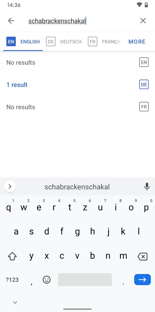
You might wonder why we don’t show results from other languages in the same list rather than having this extra tap. We intentionally designed it this way to educate readers about how to search the different language versions of Wikipedia. Wikipedias in different languages can have different content and articles might not exist across languages. The extra tap raises awareness. Plus, we didn’t want to make the slightest sacrifice in regards to search performance, and searching multiple Wikipedia languages would mean significant search speed reduction.
How did we personalize search?
In its core, the app is a browser designed to explore the contents of Wikipedia in the best possible way. Saved articles, tabs and history are a reflection of a reader’s interest. We wanted to embrace this fact and create and a more personal discovery experience for readers. The new personalized search is another highlight and a brand new experience in the world of Wikipedia.
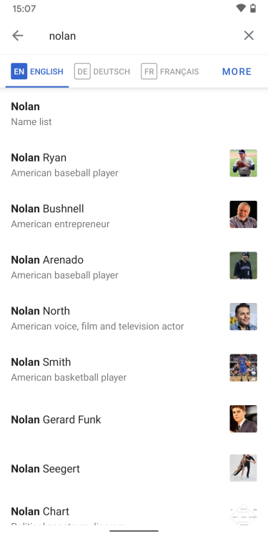
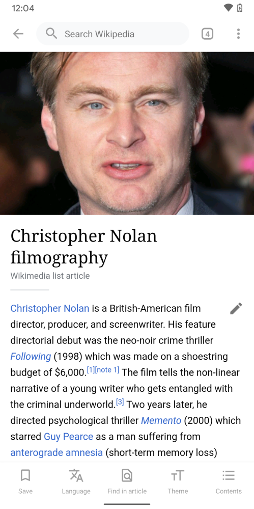
To illustrate how useful this is, here’s an example: During summer 2020, there was a brief moment in Switzerland where cinemas were open. As one of a few Hollywood blockbusters this year, Tenet made its way to the big cinema halls. A good friend, Adrian Zumbrunnen, and I have been big fans of the film’s director, Christopher Nolan for years and closely follow his career. Adrian and I were in agreement that the movie was average for Nolan movie standards, but I remember looking him up on Wikipedia that night. We were interested in rewatching Nolan’s older movies and landed on Christopher Nolan filmography Wikipedia article.
Fast forward to the end of the year when I was looking for Nolan infos in the Wikipedia Android app again. This was the result of that search query:
We’re now surfacing relevant search results based on the user’s history. Articles from open tabs, reading lists or your browsing history are shown first. The right result is presented at the right time. Here’s the new search results list in action:
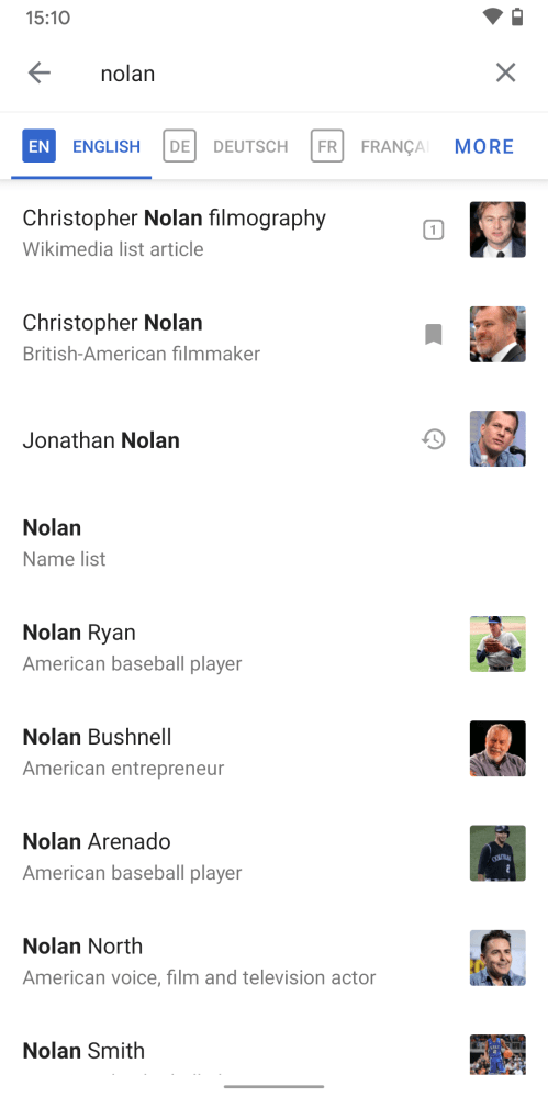
In addition to prioritizing articles that readers have interacted with in the past, we added a source indication in the form of the icons next to the article thumbnails. To ensure that readers aren’t in their own filter bubble, we show a maximum of three personalized results at a time.
What’s next?
The search for the perfect search never ends. Design is an iterative process and we’re going to continue monitoring community feedback and data in the upcoming months. All the features above are now available in the official Wikipedia for Android app on Google Play. The app is ad-free and free of charge, forever. With the Wikipedia Android app, you can search and explore 40 million+ articles in 300+ languages, no matter where you are. Our team is working on other exciting features like this, stay tuned! Let us know what you think about the updates, what you’d like to see in the app and even more importantly, which Christopher Nolan film is your favorite one and why via @WikimediaDesign on Twitter.
Thanks to Lucy Blackwell, Pau Giner, Carolyn Li-Madeo, Volker Eckl, Jess Klein, Matt Cleinman, Shay Nowick, Cooltey Feng, Sharvani Haran, Johan Jönsson, Rita Ho, Dmitry Brant, Jazmin Tanner & Anthony Borba for their contributions to this article or the features.
Related links
- Wikipedia – Apps on Google Play
- File:Polar Bear – Alaska.jpg – Wikimedia Commons
- Mobile OS market share 2019 – Statista
- Privacy policy – Wikimedia Foundation Governance Wiki
- Christopher Nolan filmography – Wikipedia
- Black-backed jackal – Wikipedia
- Schabrackenschakal – Wikipedia
- Luke Wroblewski on Twitter: ”Obvious always wins.”
About this post
Featured image and other images credit: All images used in this post were created by the author, Robin Schoenbaechler, and are licensed under a CC BY-SA 4.0 license.
A version of this post originally appeared on design.wikimedia.org on February 19, 2021.
can you tell me how to add our page like that. I am a new user in Wikipedia I don’t know how to work wiki
Hey,
Really nice post, thanks for sharing.